Thursday, 25 April 2013

Evaluation

Q1 In what ways does your media product use, develop or challenge forms and conventions of real media products? 

http://prezi.com/0vid1kxnd_y5/untitled-prezi/


Q2 


Q3 what kind of media institution might distribute your media product and why? 


http://animoto.com/play/uLLNgupyOnf0WfeUsKi2xQ - Part 1

http://animoto.com/play/Bu7lwZJ2jLGhP9Y0Jv3r1g - Part 2

Q4 who would be the audience of your media product? 

http://www.flickr.com/photos/95020926@N03/8680733486/in/photostream/


Q5 How did you attract/address your audience?


Q6 What have you learnt about technologies from the process of constructing this product?


During the creation of my music magazine i used a variety of different technologies and they have vastly helped and improved my overall product.
Obviously i used a computer however here is a list of the other technologies i used:


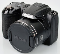
  •          Nikon Digital Camera
  •          Adobe Photoshop
  •      Internet Explorer 
  •          Microsoft Word, PowerPoint.
Nikon Digital Camera

I used this camera to take all of my images for my magazine. The fact that it is a digital camera helped me a lot as when i was taking the photographs i could immediately look at the quality of the images and also decide whether to keep them or not. Due to the memory on the camera i was able to take hundreds of photos and store them on the camera until i could look at them all properly and decided which ones i liked the best. 


Adobe Photoshop

I used Photoshop to manipulate all of my images in my magazine. It was extremely useful in the development and made all of my photographs look very professional. 
For example for my double page spread i wanted my images to be in black and white so i had to open them in Photoshop and change the colouring, however when i changed it to a black and white effect, the image looked dark and gloomy therefore i had to lighten the image and change the colour contrast. 
Also on my contents page, the main image that i used, when i first took the photograph, it had a background, so i cropped the photo out so that it had just a plain white background. 
Without Photoshop i wouldn't have been able to do any of this editing. 

Internet Explorer
Internet Explorer has been a huge help during not only the makings of my magazine but from right at the beginning when i was doing all of my research. It has helped me through the creation of my blog also as i have been able to document all the work i have done using blogger. 
During the research stage Internet Explorer allowed me to understand the conventions of a magazine and allowed me to look at examples of magazines which would help me to create my own.
Blogger has shown the skills i have used in my product and post- production stages of making my magazine. This was very helpful when it came to doing my evaluation as i could look back and remind myself of  what i had done.

Microsoft Word

This technology has allowed me to prepare the written aspects of my magazine. I wrote the interview that is featured in my double page spread in a word document and also wrote all of my blog posts in a word document to make sure i had no spelling errors and all of the sentences made sense. 


Microsoft PowerPoint


Microsoft PowerPoint has been very helpful through the production of my evaluation. On PowerPoint it is very easy to add pictures onto the slides and showing many different slides with different information and graphics on each one, enables the viewer to be more engaged.


Q7 Looking back at your preliminary task what do you feel you have learnt in the progression from that to your full product?


Monday, 25 March 2013

Contents


   Brief
    The Recce

Final Double Page Spread

This is my final Double Page spread for my music magazine.

Final Contents Page

This is my final Contents page for my music magazine.


Final Front Cover

This is my final front cover for my music magazine. 

Wednesday, 13 March 2013

Draft of Double page spread


I decided to do an interview for my double page spread, I find interviews a lot more intriguing as they do not only focus on the artists career but also on their personal life, i felt this was more appropriate for my audience as they would feel interaction with the artist, and find out interesting information about his past. 

This is a draft of my interview:


Tell us a bit about your childhood and your family.
I was born in London, i have a younger brother and sister, were very close, i don't get to see them as much anymore obviously because I'm very busy with my career, but i love going back home to visit them! My mum raised us by herself, she said it was tough as we didn't have much money but we managed. I was a very mischievous boy, always getting into trouble at school, i was given endless amounts of detentions but i still never learnt. When i left school i was so lazy, i just used to sit in the house all day, doing nothing,  that was when i started to get a passion for music, i would sit on the computer for hours listening to sets on YouTube, that's when i decided i wanted to do something with my life.

When did you first start Djing?
I first started to be interested in this kind of music when i was 15, and when you are interested in this type of music you just want to try Djing out! One of my friends had just got some decks at the time so at parties i used to try it! All of my mates said i was good at it so i got some decks for myself! I was on them constantly; i loved them!

Tell me what you’re working on and what’s coming up for you?
I have a lot of stuff coming up, I will be putting out singles first, and then remixes then maybe some collaborations. I have made some tracks for vocalist too, but we will see what happens!

How do you decide on what tracks you play during your sets? Do you prepare something in advance or just base it purely on the crowd’s reaction? 
I always have a general idea on what I’m going to play, but yeah, it does all depend on the crowd! Sometimes I will change things up completely but most of the time my sets are all my own tracks.

When you are not entertaining others how do you entertain yourself?
I meet up with my friends a lot; I don’t get to see them as much now, so whenever I’m free i tend to hang out with them. Or just chill, actually i do enjoy going to the cinema, that is, when i have time.

If you could give one tip to newbies when it comes to Djing, what would it be?
Stay unique and work hard, don’t play in front of a crowd before your ready, practice a lot.

When is your next tour?
I’m touring here in England very soon, staring on April 2nd till the 10th. The cities that I’m visiting are on my Facebook page.

Thank you for speaking with us! We really appreciate it, is there anything you would like to say to your fans?
Thanks for all the support you have given. Music would be nothing without the people who listen to it.

Double Page spread Photo editing


The image on the left and the image in the middle are both featured in my double page spread. The image on the right was the original photo, in which I then produced two images from it.

Image 1
Firstly I cropped it, so that the image was thinner so that it would fit onto my double page spread, i then changed it to a black and white photograph.
Image 2
Firstly I cropped it and made it very thin so that it would fit onto my double page spread. I only wanted one half of his face in this image and it too but very zoomed in. I again changed it to a black and white photograph and then concentrated on photo-shopping the eye. As you can see the face is slightly blurred and the quality is not as good as the original image however i wanted this effect. I liked the idea of his eye being the main focal point of the image. It makes the audience feel more involved.

Contents Page photo editing


The image on the left is the original photo. firstly I cropped the image so that there was no background, when i first took the image as you can see i took it from an angel which produced a shadow, i kept the shadow in as i thought it looked professional. I then adjusted the colour balance and brightened the image to make it stand out more. 

Front Cover Photographs


 Front Cover Images


 I chose this image as my final main image as my model is in a good position and is looking deeply into the camera, the smoke has dispersed well and is flowing in a good direction. The picture is of good quality and is very clear.
I tried to make my model tilt his head sideways so that he wasn't looking at the camera. I then took the image from a lower angel to show his importance. However I will not be using this image in my magazine as when i went to take the photograph, the flash did not go off, therefore the picture was dark and unable to focus properly. 


I will not be using this image either as when my model blew the smoke out of his mouth, he opened his mouth slightly more than i would have liked him too. He also tilted his head slightly up which looked unprofessional, i wanted him to position his head straight on, and look deeply into the camera.


Although i liked this image and the way the smoke had dispersed, when i took the image, i did not signal my model when i was taking it meaning he was not ready. He blinked and when i looked at the image his eyes were closed.


Colour Pallet


When i designed my Front Cover i decided i wanted my text to be dark blue and black, although these are dark colours, it makes my image stand out more. As i have said before the blue and black makes the magazine look professional and sets a calm mood. I looked at a variety of different blues, but i decided to stick to using the darkest blue, i used these colours throughout the whole magazine to show similarities within the pages. 

Wednesday, 16 January 2013

Fonts for my Contents page Masthead


Here is a few ideas for the font of my masthead on my Contents page. They are all very similar fonts however i decided to choose the top masthead as it is the same font as my front cover masthead showing similarity.


Saturday, 12 January 2013

Emails organising models/ location for photo shoot


This is an email that i sent to one of my friend to ask whether they would mind if I took photographs of them to go in my magazine and told them the location of the photo shoot. 

Wednesday, 9 January 2013

Photo Shoot planning


Media Production

Photo shoot planning document

What emotional impact do you want your photography to have upon the reader? How?

I want my readers to think that my images are unique and different to any other House Music magazine,  i want my protagonists to be staring right at the camera connecting with the reader. I hope for my images to look very professional and stand out. 


What personnel do you need? Who are you going to photograph?

I am taking photographs of both my male and female friends so i can rely on them to help me produce the image. My front cover image will be a medium shot of my friend staring into the camera and my other images will feature more friends dancing and posing. 


What props will you need?

I will need no props. 


How are you going to emphasise colour?

The clothing and accessories that my Protagonists will wear will be bright which will emphasise colour.

Have you briefed your personnel/models?

I am going to tell my models what i would like my images to turn out like and what i would like them to do in order for my images to look professional. I will also tell them to really interact with the camera so that the audience feel as though they are involved. 

What lighting will you need? Any other equipment?

I will be using the flash of the camera for my lighting so that i do not have to deal with natural light causing shadows and sun rays. 


Where will you shoot? Will you need a backdrop?

I will be shooting in my house and my models will be positioned in front of a plain wall so that all the focus is on the models and not the background. 


Make-up? Costume?

My female models will wear their natural face make up and smokey eye make up, this will make the images look dramatic and stand out more. As i said earlier they will all be wearing brightly coloured clothing.