Thursday, 13 December 2012

Stage 2 Magazine Proposal


Proposal Form


Describe your idea for the brief:

My article will be called Strobe, The masthead on the front cover will be capitalised and spread across the top of the page, the main image will be centralised and slightly covering the masthead creating a professional look and showing that the image is the main feature. The subheadings will be listed down to sides of the page so that there is no interference to the main image.
The contents page will be similar to the front cover with the masthead being positioned at the top. There will be a medium sized main image taking up a lot of the page and a list of contents on what the audience can expect to see within the magazine, there will also be several other images at the bottom of the page to give the audience a taste of what will be shown inside. 
The double page spread will focus on a well known artist, it will feature an exclusive interview about the artists life. The interview will be advertised on the Front cover therefore people that are interested in finding out more about the artist will be encouraged to purchase the magazine. The interview will be on one page and the image will be on the other, i have decided to set it out like this as this is the traditional layout of a double page spread. 

Genre/ sub genre: list similar texts which have inspired your thoughts

The genre of my magazine is house music, this is very unique as there are not many magazines that focus on this genre. I want it to be different to all of the magazines that are already being sold on the market. 'Tillate.com magazine' is a well known House music magazine shown worldwide, this has inspired me to do a similar genre and gave me a few ideas on what i could include in my magazine. 

Target audience: gender/ age/ characteristics/ behaviour

My target audience is a young audience ranging from the ages 14-30 as these are the sort of people that are interested in house music. House music tends not to have many lyrics in and therefore very young people and adults aren't interested in listening. I have aimed my magazine at people who enjoy going to gigs and festivals as apposed to people that listen to the UK top 40. 

 Major conventions 

Front cover
My mast head will be positioned at the top of the page and my main image will be centralised and slightly covering the masthead, this is to show the image has more significance and to show that i am confident that the audience will be enticed even without seeing the name of the magazine. I will use subheadings to give the audience a bit of information on what will be inside the magazine however not too much, leaving them intrigued. There is a website that the audience can visit which tell them all about the magazine and about the content. 
Contents page
There will be a masthead positioned as the top of the page and a medium sized image of the artist that is going to be featured in the double page spread giving the audience a visual aid and making the magazine look professional. There will be a list of content down the side of the page informing the audience of what they will be expecting to see within the magazine. 
Double Page Spread
There will be a title telling the reader what the article is about, there will be a subheading underneath giving the reader a better idea of what the article will focus on. The article will be accompanied by a large image of the artist that is featured in the article. 


Conventions I may subvert/ change/ not use

There will be a minimal amount of text in my magazine as too much writing will be off-putting for the reader, as soon as they see a huge chunk of text they will loose interest. The magazine will not be too crowded and will have sufficient text to image ratio. 
Original images: what/ where/ what

My front cover of my magazine will display a large original image of an artist. They will be standing indoors and the image will be a medium shot of the artist staring into the camera, connecting with the readers. My other images will be of friends posing and some images will be natural shots. 
Potential difficulties/ Plan B:

The quality of my images may not turn out right, to ensure this does not happen i will take the photographs on my high quality camera in order to make the images look professional. Finding models to feature in my magazine may be a problem, therefore i will ask friends if i can use them as models as i can rely on them to help produce my magazine. 


Wednesday, 12 December 2012

Photoshop skills Development 2

I created this image to advertise the Simpsons Movie. I did this by using Adobe Photoshop. I began by changing the background to a blue sky colour and adding clouds, i did this because this is the original background of the TV show which gives the audience some familiarity. I then added the original 'The Simpsons Movie' title and changed the usual position of it. I positioned it at the bottom of the page instead of the middle of the page and then added another image of homer and positioned it at the top of the page. The poster shows homer jumping for the doughnut which portrays his personality as being greedy, the audience know his character and can therefore relate to the image on the poster. Next i added the date that the Movie will be released on, i positioned it in the bottom right hand corner next to the title so that the audience read it afterwards. I chose for the colour to be black because on the title 'The Simpsons' it is also black which shows similarity within the poster.

Tuesday, 4 December 2012

Photoshop skills development 1


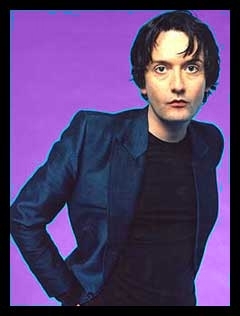
I have used Photoshop to manipulate this image of Jarvis Cocker and make it into the front cover of a magazine. I started by duplicating the layers, this allows me to have separate images of Jarvis cocker, one with the background and one without. I then changed the colour of the background, I used the Magic Wand to delete the previous background and then used the paint bucket tool to change the colour. I then used the gradient tool to change the background more so that it had a twirl effect. I then added text to the image by making a masthead and sell lines, the masthead is slightly behind the main image as it has less importance and the main image is the convention that catches the audiences eye. The Mast Head, the Main sell line and the '65' on one of the sell lines are in white text so that it stands out from the green and blue background, it is a bright colour that will attract everyones attention. The rest of the text is in a pale green colour which contrasts with the background. Lastly i added the bar code, it was very enlarged when it had loaded onto my screen therefore i had to shrink it a lot so that it was the right size to fit onto my page.

Monday, 12 November 2012

Feedback of Student Work


Feedback Sheet – Student Work 


Name of product
What I thought were the strengths
What I thought were the weaknesses


‘ROCKHOUND’


All of the images that they have used are original and are of good quality. They have used effects (black and white) on some of the images to make it look more professional. A good variety of colour has been used throughout the magazine however they have still managed to maintain a red, black and white colour scheme.  The Font on the front cover is large, capitalised and bold immediately catching the audience’s attention. The layouts of all of the pages are very different to any other magazine showing originality.

The font used for the Masthead is not very suitable; I was unable to recognise what it said. All of the text is in different fonts and different colours making it confusing and unable to read. The white text at the bottom of the Front cover is positioned on top of a stripy black and yellow background making it difficult to read.


media.png

All of the images that they have used are original; some of them are of good quality and have been cropped well. Some have special effects on and some are just natural making them look more professional. The magazine is very colourful with a clear red, pink, black and white theme.  On the Front cover all of the headings of the artists are in the same font and the subheadings below are also in the same font showing similarity. The name of the magazine is very original and looks very affective.

The smaller images on the contents page are of very bad quality and are very dark and unrecognisable, they have been squished to fit in a certain box which has distorted the image and made it unable to see it very well. Although the name of the magazine is original, it isn’t particularly clear as to what the magazine is actually called; this could impact negatively on its sales.


‘TMR’


The main image on the front cover and the double page spread is original and is of good quality. There is a clear Red, Blue, white and Black colour scheme on the Front cover and Contents page and the text is bold and stands out. The title of the magazine is slightly covered by the main image however it is still recognisable.  


Many of the images on the contents page and some on the Front cover are not original and aren’t very good quality. All of text on the Front cover is in different fonts which looks quite unprofessional. The double page spread has no colour similarity to the front cover and content page and is quite dull.


‘I.D’


Some of the images are original, all of the images on the Content page are extremely good quality. The content page looks very professional and there is a clear black and white colour scheme on the Front Cover and Contents page.  The way the double page spread is set out is very traditional in the magazine world, dedicating an entire page with an image and the other page to text. The way the ‘I.D’ card has been cropped into the image is very unique.  The double page spread has a clear Orange and White colour scheme.
The main image on the Front cover and the image in the ‘I.D’ card are of very bad quality. Most of the images on the Content page are not original and look slightly over crowded. The white text on orange background on the double page spread does not stand out as much as the white text on black background on the front cover and Contents page.

Friday, 9 November 2012

Insperation Videos


This is a few Examples of the House genre which i want to base my magazine on. Here are some examples of my favourite House music. These are very well known artists/bands which represent the genre well.

Wednesday, 7 November 2012

AS Coursework Proposal Table


Type of Magazine (fashion, music, etc)


Music
Name of Magazine


Strobe
Audience (male/female)


Male and Female
Audience (attitudes and interests)


Aged 15-25, people who enjoy clubbing/dance music.
Outlet (where it can be bought from?)


My magazine can be bought from supermarkets and online.
Necessary Information


Date, barcode, issue number price.
Selling Point


My magazine will contain interviews with artists, talking about how they first got into the music business.
Theme (article)


Interviews with well-known artists and information about tours/gigs.
Images Front Cover


Image of well-known artist.
Images Inside


Images of well-known artists doing gigs.